
Seattle Sounders FC unveil updated crest and colors ahead of the club’s 50th anniversary in 2024.
 +6
+6 Seattle Sounders FC unveil updated crest and colors ahead of the club’s 50th anniversary in 2024.


Seattle Sounders FC unveil updated crest and colors ahead of the club’s 50th anniversary in 2024.

Seattle Sounders FC unveil updated crest and colors ahead of the club’s 50th anniversary in 2024.

Seattle Sounders FC unveil updated crest and colors ahead of the club’s 50th anniversary in 2024.
Seattle Sounders FC unveil updated crest and colors ahead of the club’s 50th anniversary in 2024.
Seattle Sounders FC unveil updated crest and colors ahead of the club’s 50th anniversary in 2024.
Seattle Sounders FC unveil updated crest and colors ahead of the club’s 50th anniversary in 2024.
Seattle Sounders FC unveil updated crest and colors ahead of the club’s 50th anniversary in 2024.

Seattle Sounders FC unveil updated crest and colors ahead of the club’s 50th anniversary in 2024.
Seattle Sounders FC launched its official brand evolution today, showing a striking new crest and related marks, as well as an updated color palette, ahead of the club’s 50th anniversary in 2024. The new visual identity was created after extensive research and consultation with fans, supporters, community members, and other club stakeholders. It is intended to truly embrace the rich history and heritage of the Sounders name, more fully encompassing and celebrating every era of the club while positioning it to move boldly into the future.
“Today marks the culmination of much careful, contemplative and thorough work, and it is incredibly rewarding to now introduce Sounders FC’s brand evolution,” said Sounders FC Majority Owner Adrian Hanauer. “It was a dream achieved to bring the Sounders to Major League Soccer in 2009, but, like many of our fans, my love for the club started long before its MLS era. As Sounders, our past runs deep and proud, and that’s why we’re especially pleased to introduce this new visual identity, which isn’t so much a change as it is an evolution that more faithfully encompasses the entirety of the club. Every element in the brand now connects directly to our history. We are thrilled to continue building the Sounders legacy under our new crest as we celebrate our 50th anniversary and look ahead to the next 50 and beyond.”
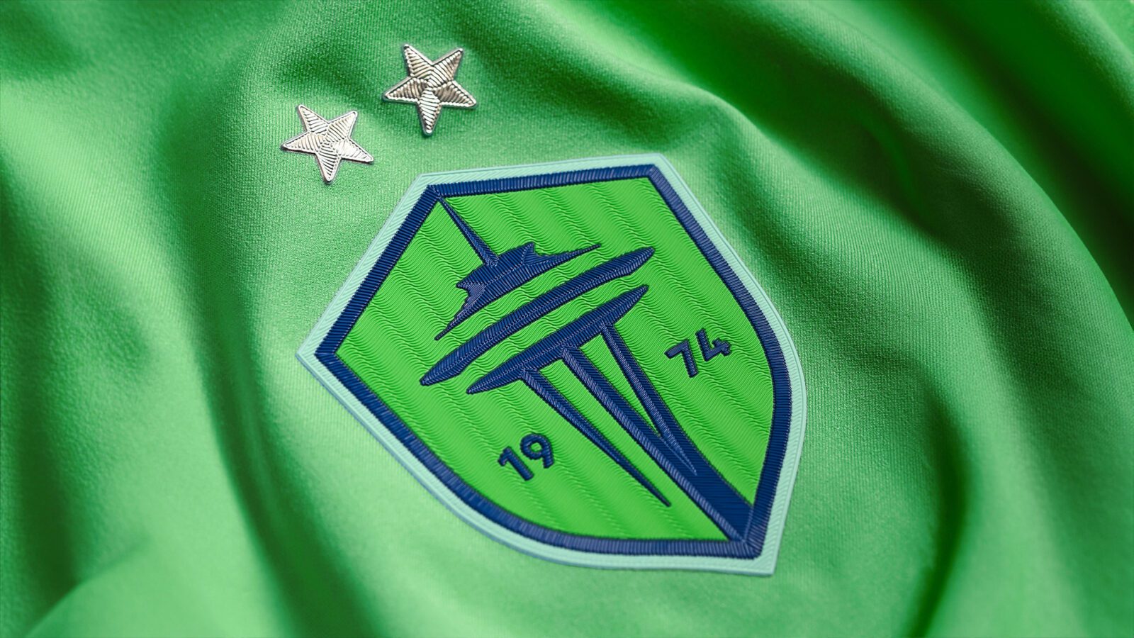
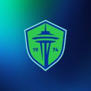
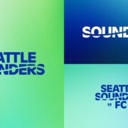
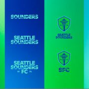
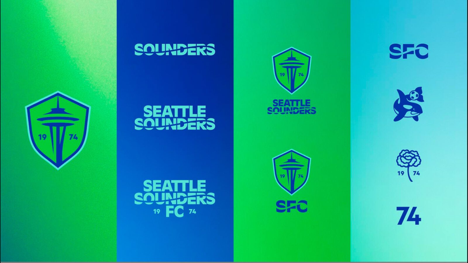
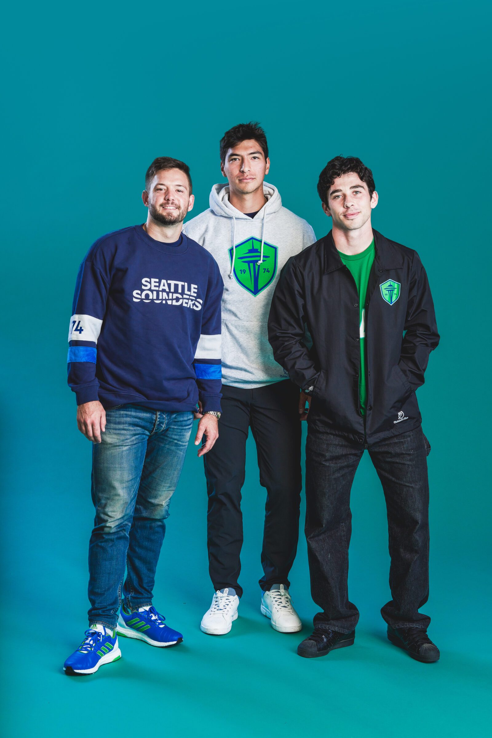
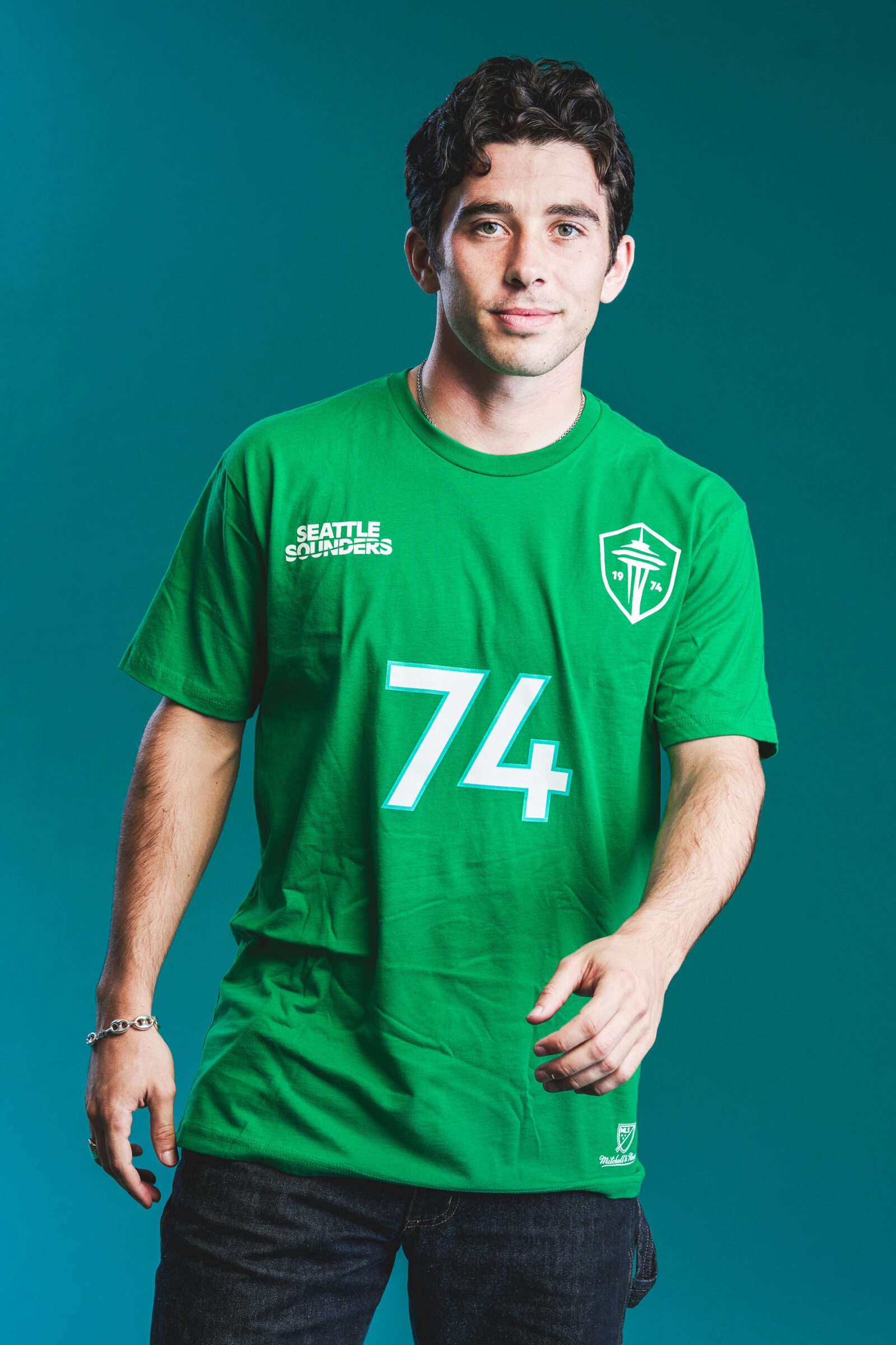
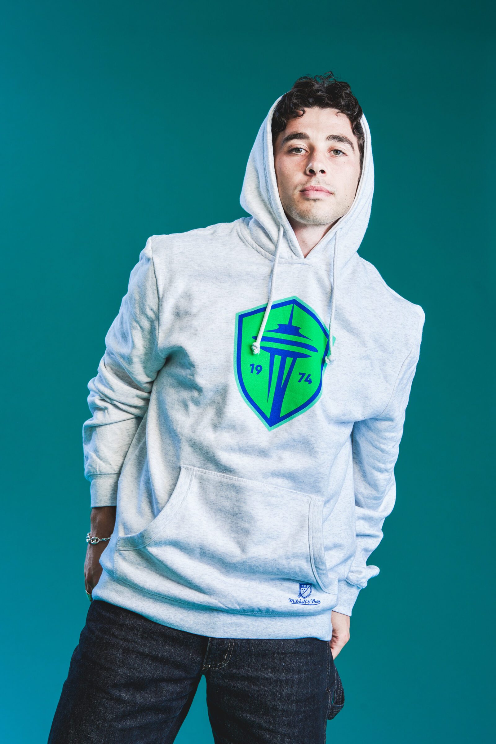
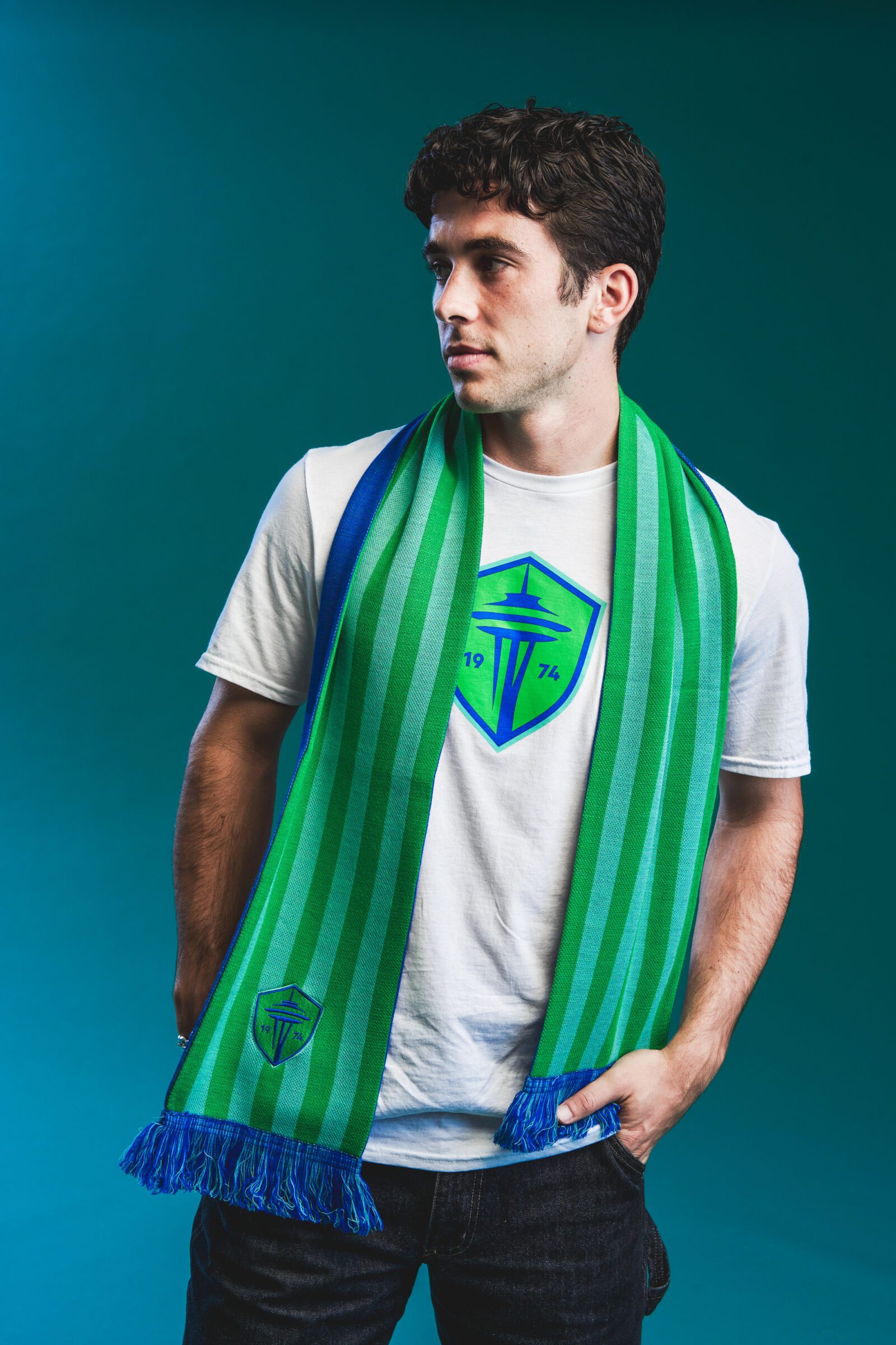
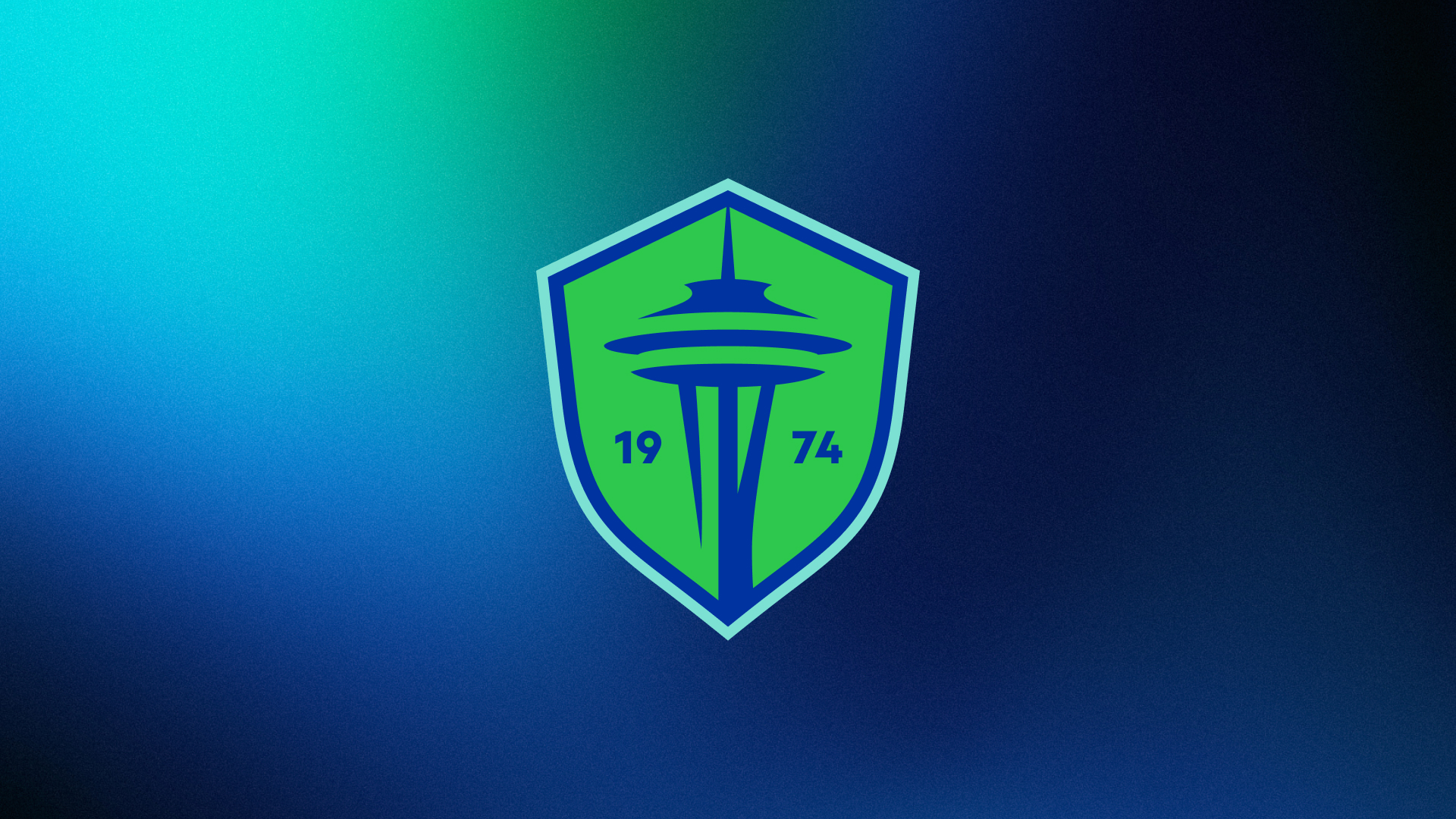
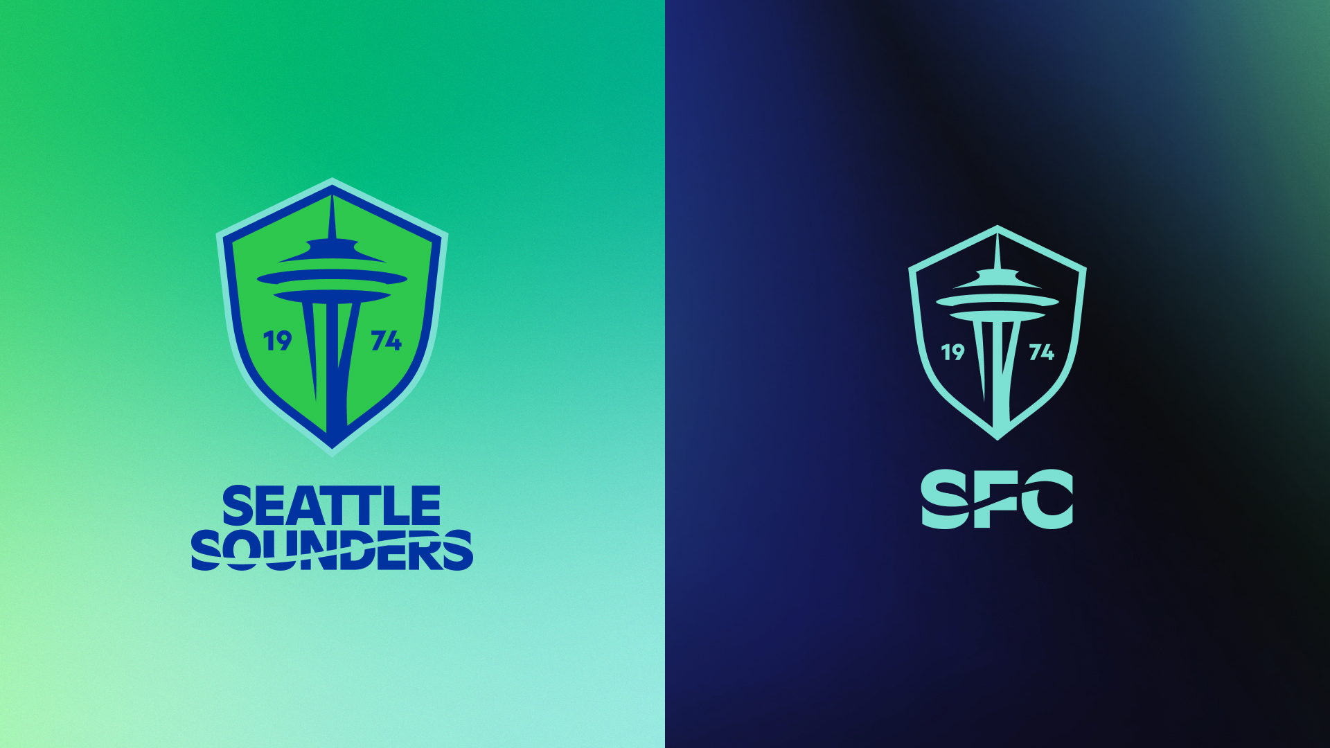
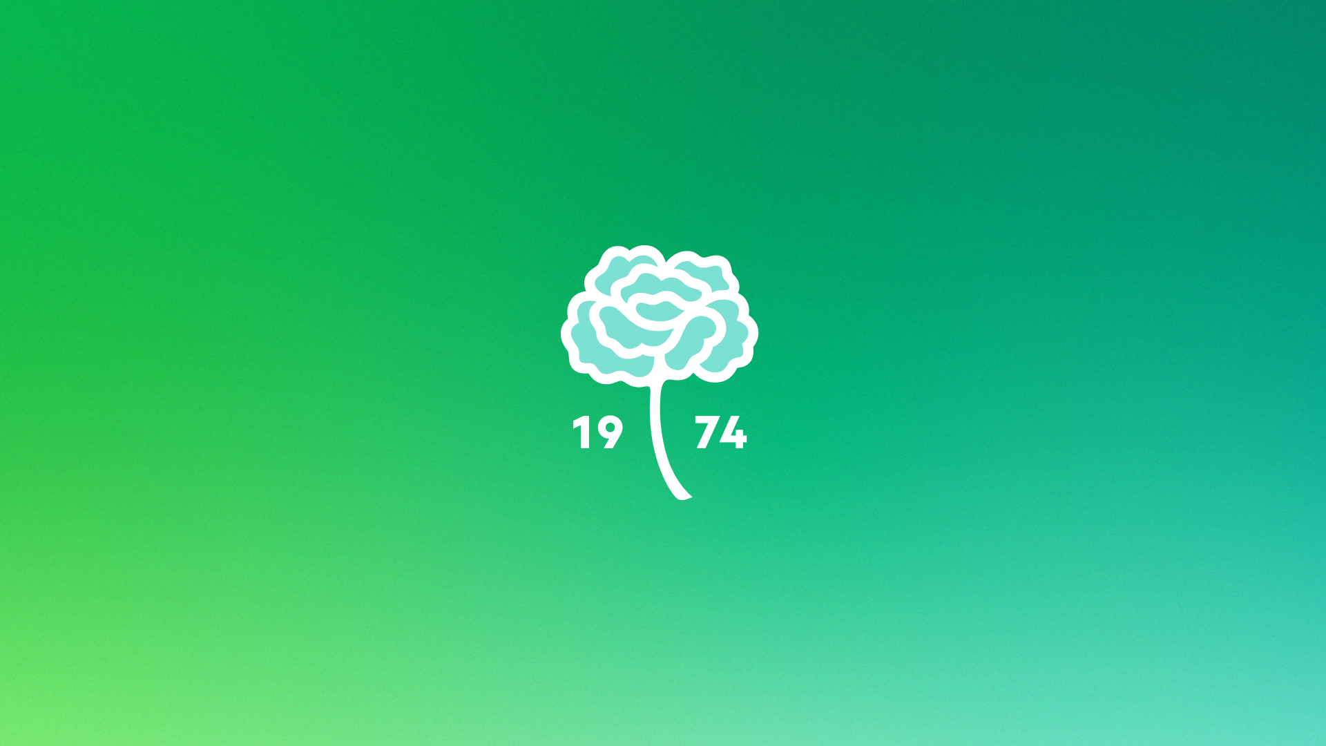
The new crest is beautiful yet classic, with a more robust – but still one-of-a-kind – badge form and modernized Space Needle picture, as well as “1974” as an explicit call to the Sounders’ founding year. Along with the crest, there are new wordmarks and secondary marks, as well as an entirely new typeface designed just for Sounders FC.
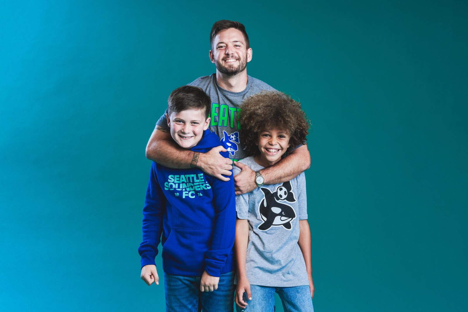
A fun, robust orca, a carnation anchored in history, a bold 74, and a shortened SFC monogram are among the new tertiary marks. Each tertiary mark has significance for the club and may be used in a range of applications, from club occasions and campaigns to merchandise and distinctive designs.
Sounders FC’s color scheme maintains “Eternal Blue, Forever Green,” with Rave Green and Pacific Blue tones slightly modified to be more wearable and a new shade of blue dubbed Heritage Aqua, which surrounds the crest and pays homage to the original Seattle Sounders color palette.
Throughout these extensive discussions about the future of Sounders FC, the club engaged through public surveys, one-on-one conversations, digital focus groups, and in-person roundtables, with the goal of providing members of the Sounders community with the opportunity to contribute their voices to the project. Season ticket holders, Alliance Council members, supporters; Sounders FC fans and general Seattle sports fans; team members, including coaches, players, and alumni; current and former club staff; community stakeholders; and Seattle tastemakers, including members of the Emerald City’s creative, fashion, and music scenes, were among those who took part.
More information about the Crest, Colors and additional marks:
CREST
Sounders FC’s evolved primary crest retains the core elements from its MLS-era mark, but it also answers the call from the club’s fans and supporters to embrace the entire history of the club. The crest’s shape remains unique across MLS, adopting a more robust form while maintaining a style inspired by the MLS-era badge’s distinctive outline. At the heart of the crest sits a modernized Space Needle design – consistently identified in Sounders FC’s fan engagement process as the singular icon that should be incorporated into the club’s visual identity as best representing Seattle both within the region and to the world.
1974 flanks the Space Needle within the new crest, an unceasing reminder of the club’s birth and place in America’s soccer history. Beyond simply denoting the beginning of the franchise, 1974 has a deep connection with the fan base – referenced in supporter songs and chants – and symbolizes the rich history that set the foundation for all future success and growth of the club.
In freshly adjusted shades of Rave Green and Pacific Blue, the crest also incorporates Heritage Aqua, a new team color directly inspired by the color palette in the original North American Soccer League Sounders badge. This aqua shade outlines the new crest, representing the constant presence of the team’s history.
WORDMARK & SECONDARY MARKS
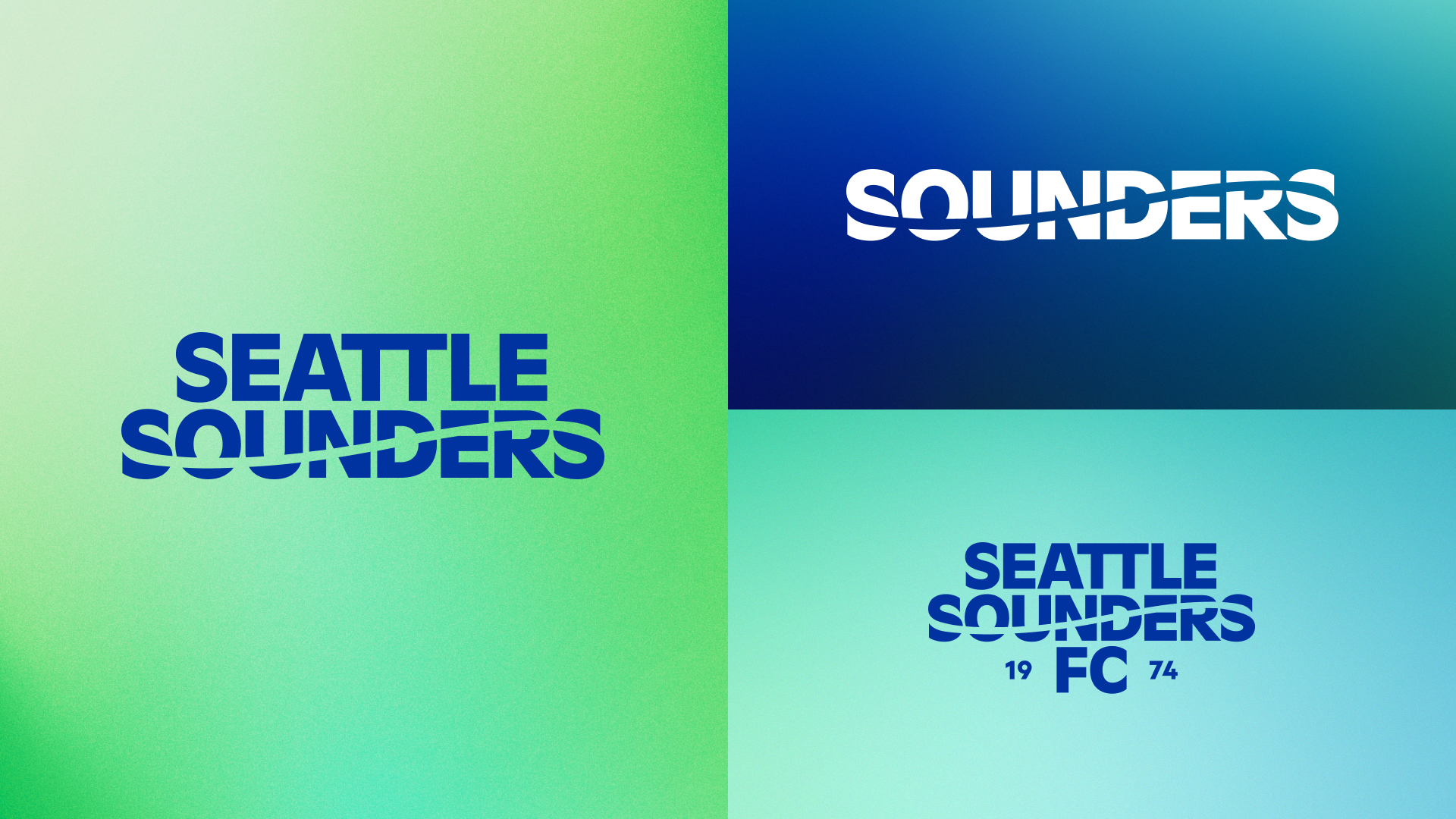
Across all fan inputs, fans were nearly unanimous in the belief that water, waves and orca whales are strong representations of the club’s visual brand; in fact, all prior Sounders marks – in NASL, USL, APSL, and A-League play – all incorporated a wave element. Sounders FC’s new wordmark reintroduces a wave element as a key component of the new identity.
Inspired by the inaugural NASL logo from 1974, a modernized Seattle Sounders wordmark takes its place in the system as a direct connection to the club’s home at water’s edge, representing the Puget Sound and its people.
The wordmark introduces the club’s new, custom-built typeface, SOUND, which is inspired by the original use of Futura Extra Bold in the original NASL logo and takes additional cues from the 1962 World’s Fair and maritime signage at the water’s edge of the Puget Sound. The expanded identity system also embraces various iterations of the club’s name, including custom marks for “Seattle Sounders FC,” “Seattle Sounders,” “Sounders” and “SFC.”
TERTIARY MARKS
Four tertiary marks have been developed as part of the new visual identity, each aimed at providing Sounders fans and supporters a variety of ways to showcase their support. These marks include:

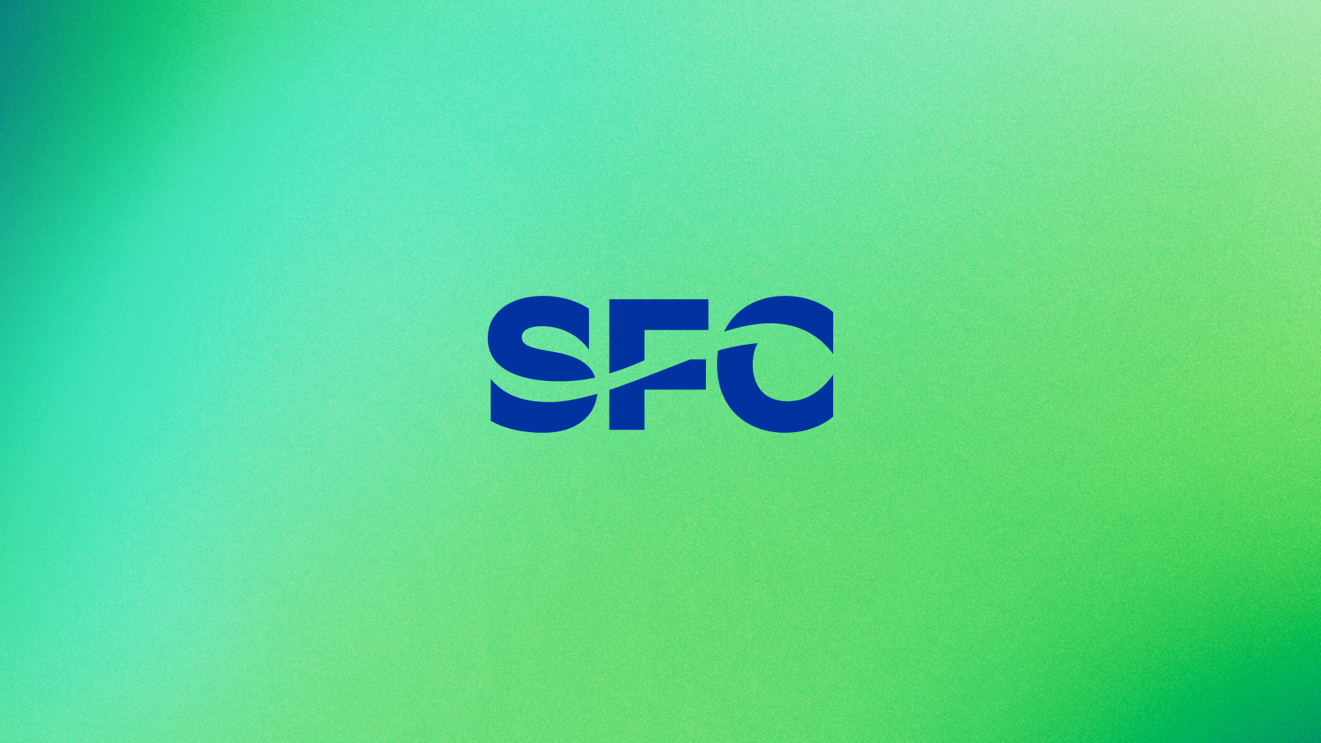
SFC Monogram – This mark provides an abbreviated naming option that incorporates the same wave motif found in the full wordmark.
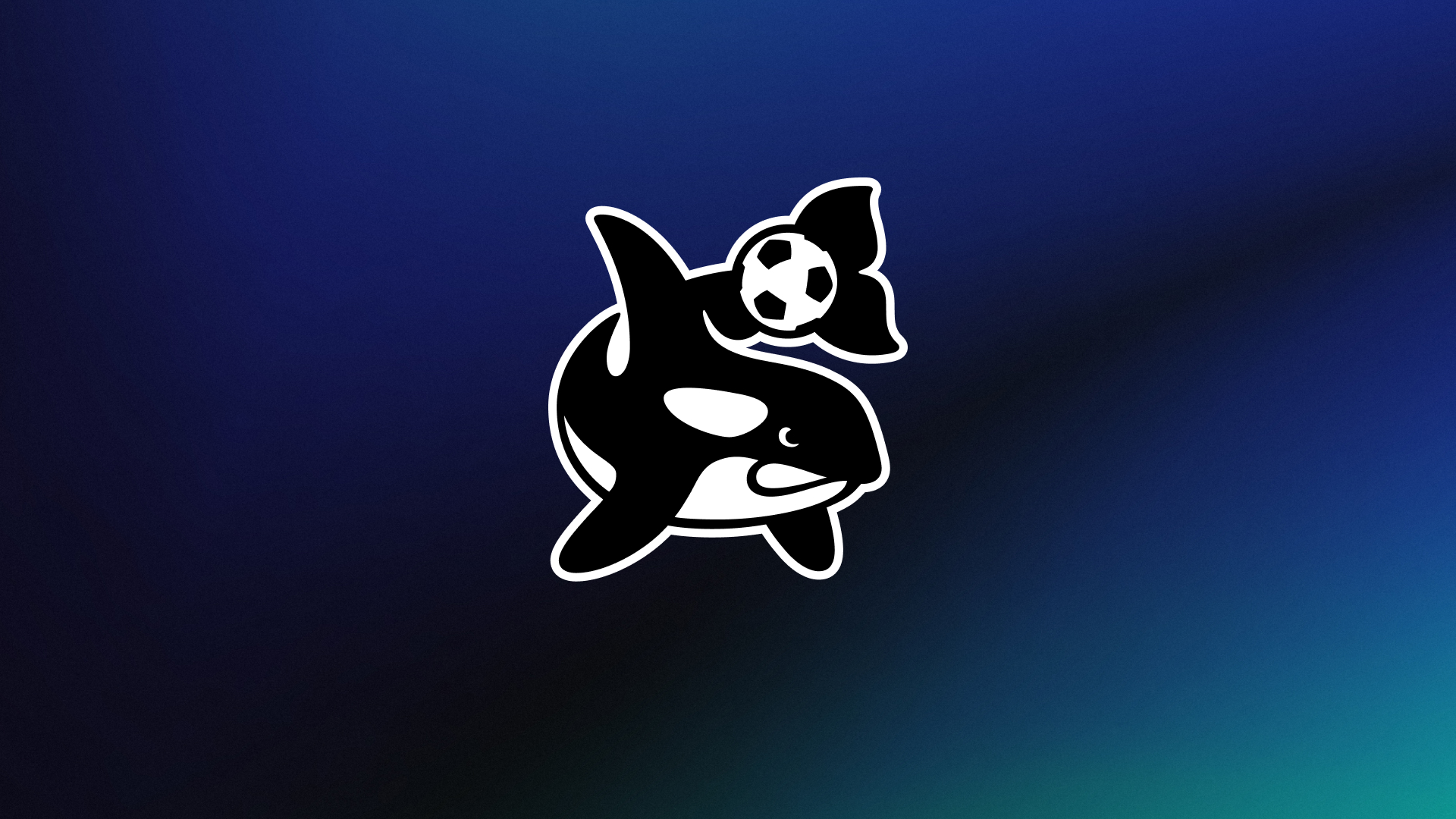
Orca – Inspired by the club’s APSL and A-League-era logos, the orca makes a triumphant return as a new tertiary mark. This mark embodies Seattle’s connection to the water and the Puget Sound, while also leaning into the quirky, unconventional spirit of Seattle. Importantly, the Orca mark also serves as a reminder of the club’s commitment to sustainability, conservation and the environment.
Carnation – Symbolizing the relationship between players and fans, the addition of the Carnation into the club’s identity system embraces and formalizes a Sounders tradition dating back to 1974 when players first handed out flowers to fans as a recognition for the fans’ support. That ceremony continues to today as players distribute carnations to fans after the final regular-season home match of every campaign.
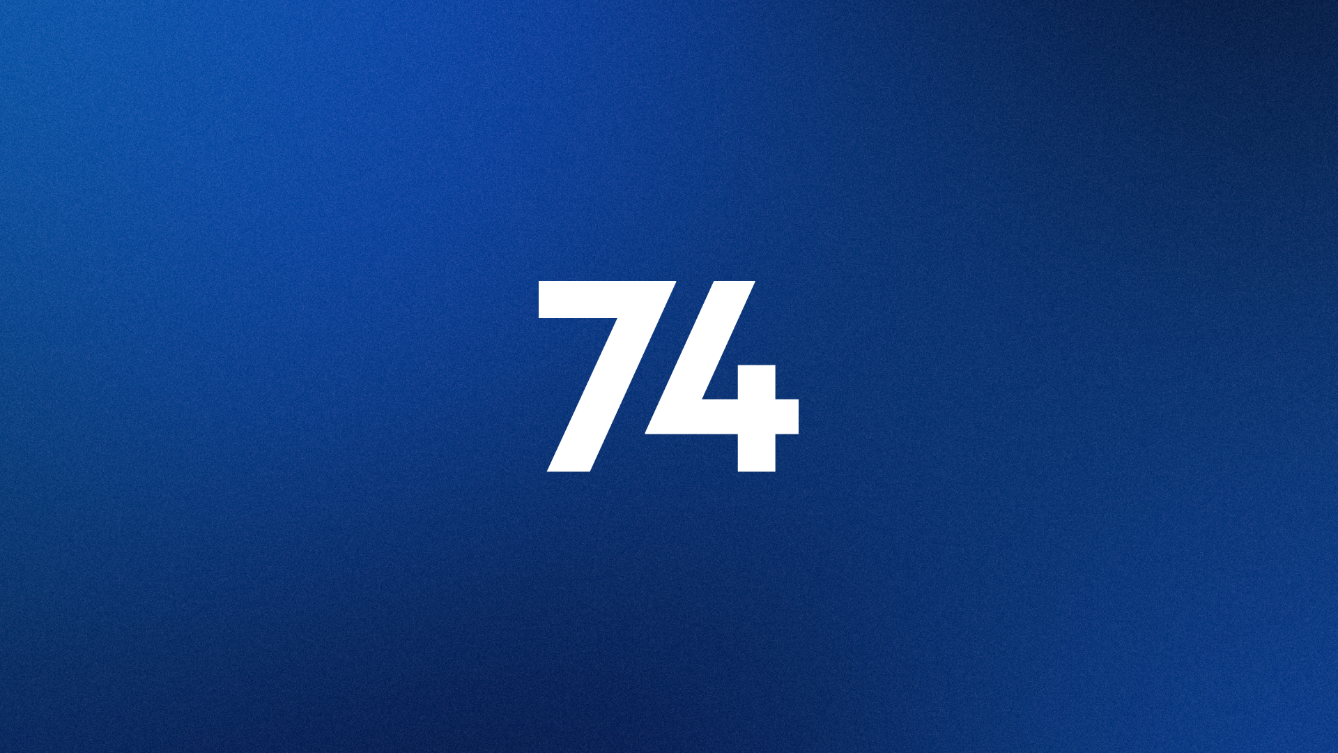
74 – 1974 is the club’s birth year, and the Emerald City’s decades-long history of supporting the Sounders is embodied in this simple, bold mark, which serves as a constant reminder of Seattle’s place in American soccer history.
COLORS
Throughout the extensive research gathering process, fans made it clear that the club’s core colors were an element not up for debate. The theme of “Eternal Blue, Forever Green” is intimately tied to Sounders FC, from the songs of the club’s supporters to the team’s Rave Green moniker.
However, recurring sentiment from fans centered around the official pantone of these colors, with many noting its lack of accessibility and wearability on a day-to-day basis outside of matchday at the stadium. With this in mind, the energy of the club’s official colors remain Rave Green and Pacific Blue, though the final tones have evolved – still uniquely Sounders, but with shades more adapted for all fans to wear proudly.
In addition to evolving Rave Green and Pacific Blue, Sounders FC has also introduced Heritage Aqua as a new official team color. Paying homage to the original color palette of the club in 1974, Heritage Aqua outlines the new crest and can also be found in tertiary marks.
